At Adina Designed Interiors we can cater for all your cabinetry needs. We pride ourselves on good honest advice, professionalism and quality work built to last.
Interior Design Colour Trends 2026: What's Trending & What We're Loving

If you've been feeling the urge to update your space with something fresh and beautiful, you're not alone. The interior design colour trends 2026 are here, and they're bringing a wonderful blend of warmth, depth, and personality that feels like a welcome departure from the stark minimalism of years past. This year's palette is all about colours that tell a story: rich, earthy tones that feel lived-in, dusty jewel shades that whisper sophistication, and unexpected combinations that somehow just work.
We've dug into the latest predictions from leading paint brands, colour experts, and working designers to bring you the colours that are genuinely making waves. Whether you're planning a complete renovation or just want to add a few new cushions, here's what's trending for 2026.
Warmer, Richer Neutrals Are Having Their Moment
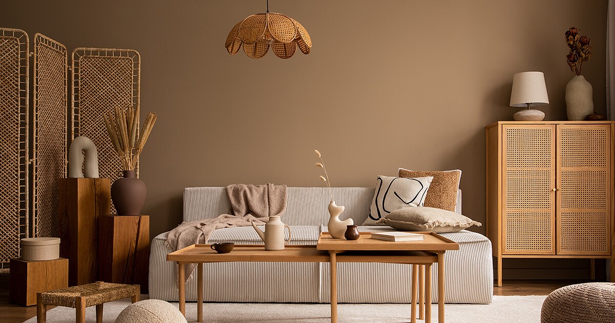
Forget millennial grey - it's officially had its day. The neutrals trending for 2026 are warm, comforting, and have actual character. We're talking creamy beiges, warm taupes, and those gorgeous earthy browns that look like they've been sun-soaked for decades.
Paint brands are leading the charge here. Benjamin Moore's 2026 Colour of the Year, Silhouette, is a rich espresso with charcoal undertones that manages to feel both dramatic and inviting. Meanwhile, brands like Dulux are championing warm whites and neutrals paired with golden brown hues that create depth without feeling heavy.
Interior designers are noticing the shift in their client requests, too. People are moving away from cool greys towards finishes that feel friendlier and less austere. Think walnut wood tones instead of white oak, caramel instead of greige. These warmer neutrals create the perfect backdrop for bolder accent colours while still feeling timeless and sophisticated.
Dusty Jewel Tones Are Stealing the Show
If there's one trend that's got designers genuinely excited for 2026, it's the evolution of jewel tones. But these aren't the saturated, bright jewels of previous years. They are dustier, more muted, and infinitely more sophisticated.
Think deep sapphire and Prussian blues, muted emeralds and earthy greens, subdued cranberry reds, and gorgeous plum tones. These colours bring depth and dimension to interiors without overwhelming a space. They're the kind of shades that feel both calming and luxurious at the same time.
Little Greene's Colour of the Year, Adventurer, perfectly captures this trend. It's a regal plum-aubergine that works beautifully in bedrooms, dining rooms, and bathrooms. Pair these jewel tones with warm neutrals and natural materials for a look that's both grounded and elevated.
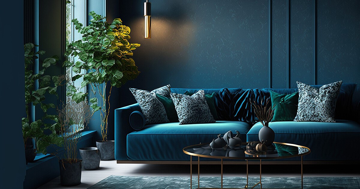
Teal Is the Blue-Green Everyone's Talking About
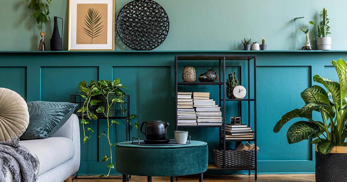
Blending the calming properties of blue with the refreshing quality of green, teal is emerging as one of the standout colours for 2026. Behr's Colour of the Year, Hidden Gem, is a smoky jade that embodies this trend perfectly. It's sophisticated, versatile, and brings an element of nature indoors.
What makes teal so appealing is its ability to work in almost any room. It's bold enough to make a statement but subtle enough that it won't feel overwhelming. Whether you use it on an accent wall, in furniture, or through accessories, teal brings a sense of tranquillity and style that feels fresh for 2026.
Earthy Greens and Moody Browns Are Replacing Brighter Shades
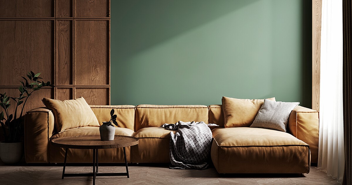
Forest green had its moment, but 2026 is all about earthier, more nuanced greens. We're seeing khakis, olives, and those gorgeous muddy greens that look like they belong in the natural world rather than a paint swatch.
The browns trending for 2026 are equally interesting. Gone are the flat, heavy browns of decades past. Instead, we're seeing browns with character - greenish-browns, reddish-browns, greyish-browns - that have depth and complexity. These are the kinds of colours that feel restorative and grounding, perfect for creating spaces that feel like a sanctuary.
Valspar's Warm Eucalyptus captures this trend beautifully, offering a muted green with warm undertones that pair well with other earthy hues.
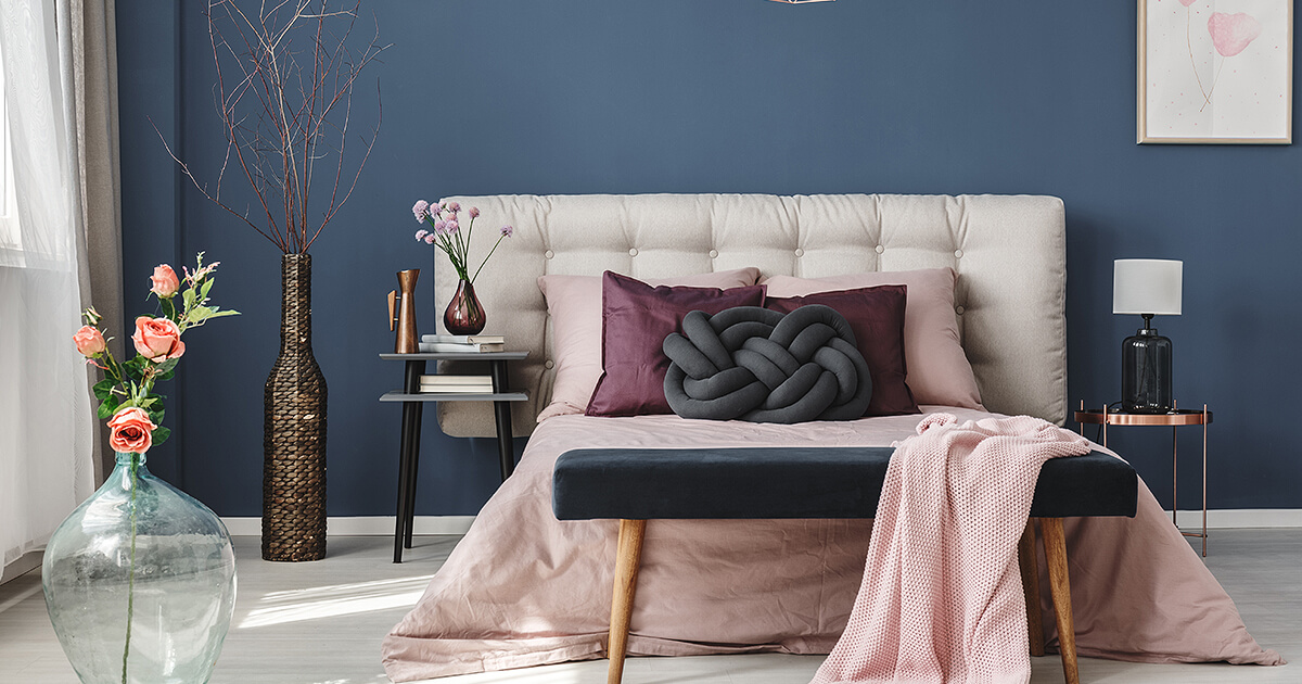
Wine Reds and Raspberry Pinks Add Warmth and Drama
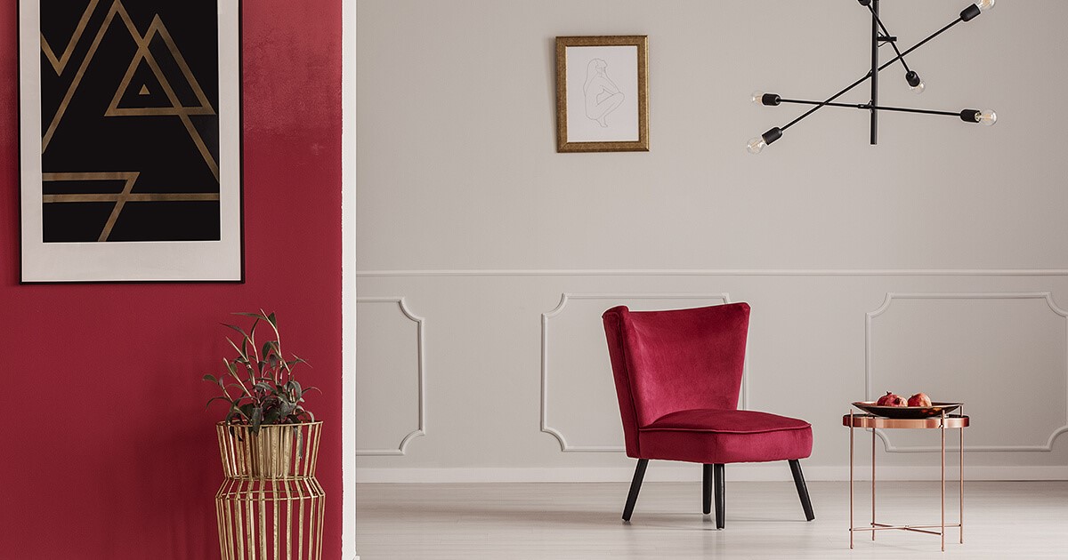
Move over tomato red, 2026 is about deeper, richer reds with wine and burgundy undertones. These sophisticated shades bring warmth and drama without feeling overwhelming. They pair beautifully with natural wood tones like walnut and mappa burl, creating a layered, elevated look.
For those wanting something a bit brighter, raspberry pink is making a surprising appearance. It's joyful, rich, and works wonderfully as an accent colour where you want an injection of personality.
Blues Are Back in a Big Way
Blues of every description are trending for 2026. From pale, milky pastels to rich indigos and inky navies. These aren't the cold blues of the past, though. The blues trending for 2026 have warmth and depth, creating spaces that feel cocooning rather than stark.
Navy, in particular, is making a comeback with a distinctly 1970s vibe. Designers are pairing inky blues with sun-baked tones like terracotta, burgundy, and burnt orange for combinations that feel both nostalgic and fresh.
Unexpected Colour Pairings Are Where the Magic Happens
Perhaps the most exciting trend for 2026 is the willingness to experiment with high-contrast, unexpected colour combinations. Designers are moving away from safe, matchy-matchy schemes towards pairings that shouldn't work in theory but create undeniable atmosphere in practice.
Think satin periwinkle with velvet chocolate, high-gloss chartreuse with matte baby blue, or matte tangerine with metallic moss. These bold combinations reflect a shift towards interior design that's more about personal expression and less about following rigid rules.
Some designers are using a technique called "colour capping," where they use varying shades of the same colour throughout a room to create depth and cohesion. It's a sophisticated approach that lets you be bold while maintaining harmony.
What This All Means for Your Space
The interior design colour trends 2026 tell us something important: people want their homes to feel personal, warm, and meaningful. We're moving away from spaces designed for Instagram perfection and towards interiors that feel lived-in and loved.
Whether you embrace dusty jewel tones, warm neutrals, or unexpected colour pairings, the key is choosing colours that resonate with you. These trends aren't about following rules; they're about giving yourself permission to be bold, to take risks, and to create spaces that genuinely reflect who you are.
The beauty of 2026's colour palette is its versatility. You can go all-in with a dramatic teal bedroom or simply add a few wine-coloured cushions to your existing scheme. You can embrace the warm neutral trend with new paint, or bring in earthy greens through plants and accessories. There's no wrong way to approach these trends, just what feels right for your home.
So if you've been hesitant to move away from safe neutrals, 2026 might be your year to experiment. The colours trending now have depth, character, and staying power. They're colours you can grow with, colours that will still feel relevant in five years, and colours that make coming home a little more joyful.
What colour are you most excited to try in your space this year?
Adina Designed Interiors
Queensland Wide Service
Bundaberg
2/35 Enterprise St
Bundaberg Central, QLD 4670
Ready to have your design vision come to life?
Get our creative team of designers and craftsmen to help you create a memorable space.